Thursday 25 April 2013
Tuesday 23 April 2013
Monday 22 April 2013
Audience feedbak
In order to gain audience feedback on my music video, we held viewings where I gave out a questionnaires and then held focus groups. In order to gain more audience feedback from our target audience (being young teenage girls) we had to target social networking sites. I posted our music video on Facebook and tweeted about it. We also shared our video through the use of journals and poles on DeviantArt.


Magazine Advertisement

Monday 8 April 2013
Digipak pieces
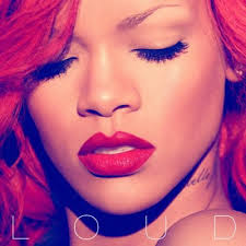
Here is the leafet for inside the digipak I created for are advertisment task, I included bright shocking colours mostly shades of pink to attrack our target audience and I aimed for the front cover to be colourful to get seen and noticed more then other would. The colours I used for the digipak matches the mise-en-scene and photos of the shoots and music video to create conitunity throughtout my advanced portfolio. I wanted the artist to look vibrant and glowing so I adjusted the contrast and colours of the photo to make the picture look more inviting. I also made the digipak look realistic by putting a product code on the back of the digipak cover as other digipaks that I looked at all had these.
Here is the template of the final digipak leaflet in order from the left is the middle pull out page, the back cover and the front cover :

Here is the middle of the digipak as you would see if you opened it up:

Here is the CD part of the digipak I created, i wanted it to be simple yet reflect some of the imagery on the cover so i have used the same flower for this.

Digipak
One of our ancillary tasks we had to create a digipak, so I looked online for a template to help me with the sizes and I found a really useful website that lets you download a template for different sizes : http://visionvangogh.com/pages/CDTemplates/
I when for the six page folder as it is slightly smaller which is good as we are only advertising a single not an album so we only have one song to include.
To help me with design I also looked at other digipaks out there that are for singles and here are the ones I liked inparticular :


I when for the six page folder as it is slightly smaller which is good as we are only advertising a single not an album so we only have one song to include.
To help me with design I also looked at other digipaks out there that are for singles and here are the ones I liked inparticular :


Our Final A2 Advanced Portfolio
This is our final music video 'Chuck Norris' we created for our A2 Advanced Portfolio, it was hard work but great fun, hope you enjoy:
Poffestional Feedback on our Rough Cut

First of all he mentioned he liked the amount and variety of locations we have as he said it kept it interesting for the audience and kept them on there toes. He also especially liked a shot we have in our video of our singers reflection in the water cross cut with her on the bridge.

We then when onto show him one of our stop motion animations which we planned to use in our music video, he was very help coming up with al sorts of ways in which we could incorporate this into are music video. The suggestions we really liked and are going to use are layering the stop motion animation onto our singer and inverting the colours to add more dimension. We found this Skype chat really helpful and we also had few questions we liked to ask him, he is shortly going to send us the answers he came up with which will help greatly in further studies.
Stop Motion Animation
We wanted to add stop motion animation for at least a whole chorus but thought it would look weird in one big bulk so decided to split the chorus into two and add them in at different choruses during the video to split up and make the video flow better. I got the challenge of making a stop motion animation for the second half of the last chorus, with the lyric of
'Swim with sharks just to feel the danger
or flipping the bird to a mean state ranger
No- the dumbest thing I could say, is 'I don't look at you that way'
Yeah the dumbest thing I could do, is say that I didn't love you'
Here was my story board for my stop motion animation and some of the pieces I used to create the real thing :


My partner also created the first half of the chorus and made it into a YouTube video before adding it to our final portfolio and this is what it looks like:
Subscribe to:
Posts (Atom)